

IELTS Academic Writing Task 1 asks you to describe visual information in at least 150 words within approximately 20 minutes. You receive a chart, graph, table, map, or process diagram, and you must summarise the main features in your own objective words. The task is purely descriptive: no opinions, no predictions about why the data looks this way, no judgments about whether trends are good or bad. Task 1 contributes one third of your overall Writing band score.
Task 1 Academic at a glance
Academic Task 1 is always data-driven (chart, graph, diagram, or map) - see the official IELTS Academic Writing format.
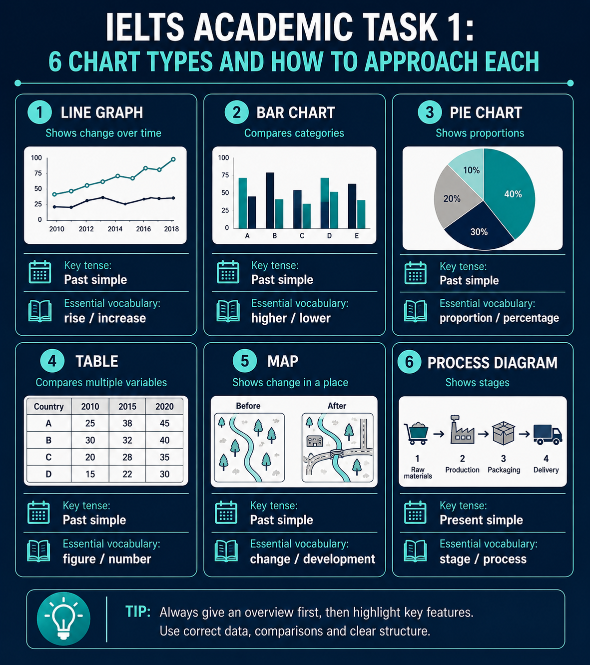
The six chart types you will see
Academic Task 1 uses six main visual types. Each has its own optimal approach and vocabulary requirements. Knowing what to expect from each type cuts your planning time and improves your task achievement score.
Line graphs
Show change over time. Focus on overall trends (rising, falling, fluctuating), starting and ending values, and turning points. Vocabulary needed: rose, climbed, peaked, declined, plateaued.
Bar charts
Compare categories or show data at specific points. Focus on highest and lowest values, comparisons between categories, and significant differences. Use comparative language throughout.
Pie charts
Show proportions of a whole. Focus on largest and smallest segments, segments that together form majority/minority. Vocabulary needed: account for, comprise, make up, represent.
Tables
Show numerical data across multiple categories. Focus on highest/lowest, biggest changes, notable comparisons. Do not try to describe every cell, select the most significant data only.
Maps
Show how a place changed over time, usually two maps to compare. Use past tense for what was there, present tense for what is now. Vocabulary needed: replaced by, demolished, converted into, added.
Process diagrams
Show stages of a process or cycle. Use sequence words (first, then, subsequently, finally) and passive voice. Tense depends on whether process is natural (present) or industrial (present/passive).
Multi-data tasks combining two charts or chart types appear in approximately 40% of recent tests. You might see a line graph plus a pie chart, or two bar charts comparing different aspects. These multi-data tasks reward structured organisation more than single-chart tasks.
The six Academic Task 1 chart types at a glance
| Chart type | How often | What it shows | How to approach it |
|---|---|---|---|
| Line graph | Most common | Change over time | Focus on trends and turning points: rose, peaked, declined |
| Bar chart | Very common | Compares categories | Use comparisons: highest, lowest, far more than |
| Pie chart | Common | Proportions of a whole | Largest and smallest shares: account for, make up |
| Table | Common | Numbers across categories | Pick key figures only, do not list every cell |
| Map | Harder | How a place changed | Past tense for before, present for now: replaced by, converted into |
| Process diagram | Harder | Stages of a process | Sequence words and the passive: first, then, finally |
The four-paragraph structure that works
For all Academic Task 1 types, a clear paragraph structure makes the examiner's job easier and lifts your Coherence score. The structure we recommend:
Introduction
Paraphrase the question in 1-2 sentences
Overview
Summarise 2-3 most important features, no specific numbers
Detail para 1
First half of data with specific figures
Detail para 2
Second half of data with specific figures
The overview paragraph is critical. Without it, your Task Achievement score is capped at band 5. The overview should not include specific numbers, it identifies the big-picture trends only.
How Task 1 Academic is marked
Task 1 is graded against the same four criteria as Task 2, each worth 25% of your Task 1 band:
Task Achievement
Did you identify the main features? Include an overview? Cover the required data without missing key information?
25% of Task 1Coherence & Cohesion
Logical paragraph structure with overview, clear organisation, appropriate linking between sentences?
25% of Task 1Lexical Resource
Range of trend vocabulary (rose/fell, climbed/dropped, peaked/troughed), accurate comparison language?
25% of Task 1Grammatical Range & Accuracy
Mix of sentence structures, correct tense for time periods, accurate comparative forms?
25% of Task 1Band 5 vs Band 7 description compared
The same data point described at two band levels shows what examiners look for. Data: car ownership in the UK rose from 50% in 1980 to 80% in 2020.
"The graph shows that car ownership went up from 1980 to 2020. In 1980 it was 50% and in 2020 it was 80%. So it went up by 30%."
"Between 1980 and 2020, car ownership in the UK rose substantially, from 50% to 80%. This represents an overall increase of 30 percentage points across the four-decade period, with the steepest growth occurring between 1990 and 2000."
The mistakes that cost most candidates half a band
Writing under 150 words
Under-length responses are penalised in Task Achievement, typically by half a band. Always finish a complete paragraph after you hit 150 words.
No overview paragraph
An overview summarising the main features is essential. Without it, your Task Achievement score is capped at band 5. The overview should be the second paragraph and contain no specific numbers.
Including personal opinions
Academic Task 1 is purely descriptive. Phrases like "This is concerning", "The increase is positive", or "I think this will continue" lower your Task Achievement score.
Including every single data point
Listing every number shows you cannot identify what matters. Focus on the most significant trends, comparisons and extremes. Select 4-6 key data points to highlight, not all 20.
Most candidates spend 25-30 minutes on Task 1 trying to make it perfect. This is the single biggest scoring mistake in IELTS Writing. Task 2 is worth twice as much. Spending an extra 5 minutes on Task 1 to gain half a band costs you a full band on Task 2.
Useful vocabulary for Academic Task 1
Trend vocabulary at different magnitudes helps your Lexical Resource score. Avoid repeating "increase" and "decrease" throughout your response.
- Sharp rise: soared, surged, rocketed, climbed sharply, jumped
- Steady rise: grew steadily, rose gradually, climbed consistently
- Small rise: inched up, edged up, crept up, rose slightly
- Sharp fall: plummeted, plunged, dropped sharply, dived
- Steady fall: declined steadily, decreased gradually, fell consistently
- Small fall: edged down, slipped, declined slightly
- Stability: remained constant, plateaued, levelled off, stayed steady
- Fluctuation: fluctuated, oscillated, varied, swung
Choose your preparation path
Frequently asked questions
How many words should I write for Academic Task 1?
Aim for 160-180 words. The minimum is 150 but going slightly over gives you a safety margin if the examiner discounts any text copied from the question. Writing more than 200 words wastes time you need for Task 2.
Do I need to include all data points in Academic Task 1?
No. Including every number actually hurts your score because it shows you cannot identify which data points matter. Focus on the most significant trends, comparisons and extremes.
Should I use first person in Academic Task 1?
Generally no. Academic Task 1 should be objective and impersonal. Avoid phrases like "I can see that" or "I think". Use neutral phrasing: "The graph shows", "It is clear that", "The data indicates".
What tense should I use for Academic Task 1?
Match the tense to the time frame shown. Past tense for historical data (1990-2010). Present tense for current data with no time reference. Future tense for projected data (typically after 2025+).
Can I make predictions about future trends in Task 1?
Only if the chart itself shows predicted/projected data. If the data ends in 2025 with no projection, do not predict beyond that. Speculating about why trends happened or what they might mean is not part of Task 1 either.